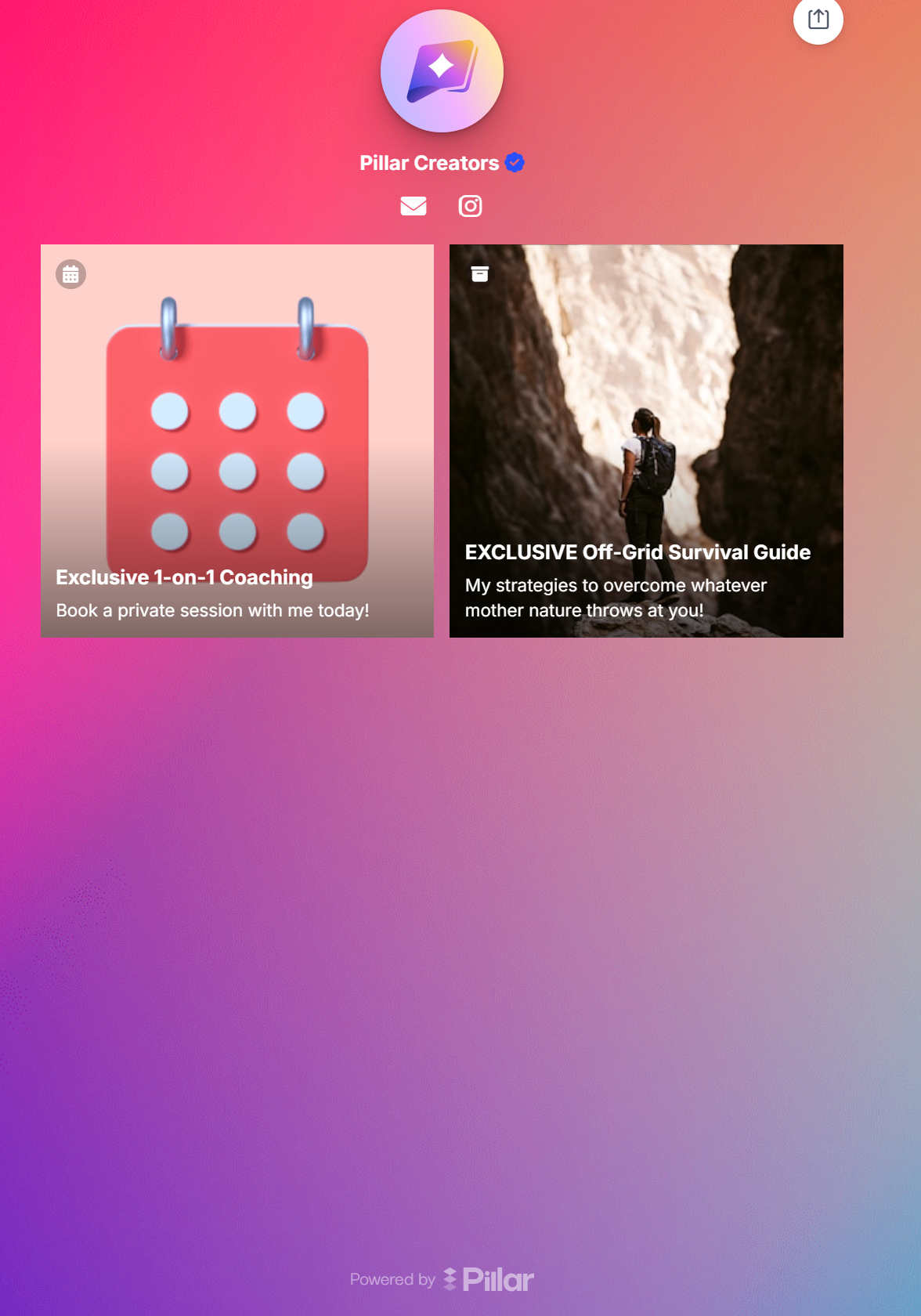
Adding and Styling Digital Product Links
Are you trying to sell a digital product on Pillar to earn some 💲? The first step is to guarantee it looks good in your link-in-bio creator store. The corresponding block in your store is a potential buyer's first impression of your product, so make it count!
Adding a Block
No matter what digital product you're trying to sell, the first step is always to get to the selection page. Make sure you're in the creator store builder, then click Add Store Item.

The following four types of digital products could be directly sold for money:
Although they are by no means the only way Pillar helps you monetize your creator business, they are going to be the focus of this article. You may select any of them to get started.

Editing the Block
Follow the outlined steps to design your digital product block for your link-in-bio creator store. Try to find a thumbnail image that is both captivating and represents the product you're trying to sell. Also use a catchy title/subtitle/button to draw visitors' attention.

A Note About Layout
Pillar offers four layout options for digital product blocks. The default layout, shown above, is called the Panel layout option, where there is a large horizontal button and small thumbnail image. You may also style your blocks as links or tiles.
Links appear the exact same way as links to external URLs. The only difference is that once these links are clicked, the viewer is redirected to a checkout page on your Pillar store. Tiles are square blocks that have the full thumbnail as the background. They look quite nice when you have a lot of blocks on your store.

